How often do you want to get fresh cat food?


Project Overview
The product
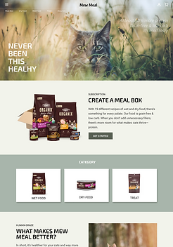
Mew Meal is a cat food delivery service that offers human-grade fresh food. The typical user is busy working adults who seek for easy preparation of high quality food for their cats. Mew Meal’s goal is to make life with cats more fun and healthier through customized meal plans tailored to cat’s needs
The problem
Available online cat food delivery service only have monthly subscription plan which brings concern for expiration date of the fresh food, and it is inconvenient for customers to follow recommended storage method.
The goal
Design a Mew Meal website to be user friendly by providing flexible scheduling and offering a fast checkout process.
Project type
Solo case study
UX/UI Design - Responsive web
Responsibilities
Conducting interviews, paper and digital wireframing, low and high-fidelity prototyping, conducting usability studies, accounting for accessibility, iterating on designs and responsive design
Project duration:
March 2022
UNDERSTANDING THE USER
User Research
I conducted user interviews, which I then turned into empathy maps to better understand the target user and their needs. I discovered that many target users wants to feed their cats fresh food that are free of preservatives, but they are too busy or doesn’t know how to make raw food. Many meal delivery service websites only offer a monthly subscription plan which frustrated many target users. The inflexible scheduling makes them worry about a storage method and expiration dates.

User Pain Points
Scheduling
Online cat food subscription services don’t provide a flexible scheduling experience
Customization
There is no customization feature in many pet shopping websites where users have to pick items by themselves.
Navigation
Online pet shopping website designs are often busy and overwhelming, which results in confusing navigation for making meal plan
User Persona
Mati is a busy worker who needs cat food delivery service with flexible scheduling because they don’t want to worry about keeping expiration dates or overstock.

Name: Mati
Age: 34
Occupation:
software developer
Mati has raised two cats for 4 years. One of his cat recently had weight and gastrointestinal issue, so he decided to change the cat’s diet to more high quality one. He is using a cat delivery service which offers monthly subscription plan.
He is frustrated with their delivery scheduling experience. Sometimes he wants to get the food weekly because he can store the wet food in room temperature for a week and doesn't need to worry about freezing and defrosting it every day.
User Journey Map
I created a user journey map of Mati’s experience using the site to help identify possible pain points and improvement opportunities.

Competitive Analysis
An audit of a few competitor’s products provided direction on gaps and opportunities to address with the Mew Meal app


STARTING THE DESIGN
Sitemap
Difficulty with website navigation was one of pain points for users, so I used that knowledge to create a sitemap.
My goal here was to make strategic information architecture decisions that would improve overall website navigation. The structure I chose was designed to make things simple and easy.

Wireframes
PAPER WIREFRAMES
Next, I sketched out paper wireframes for each screen in my app, keeping the user pain points about navigation, browsing, and checkout flow in mind.
The home screen paper wireframe variations to the right focus on optimizing the browsing experience for users.


Refined paper wireframe
DIGITAL WIREFRAMES
Moving from paper to digital wireframes made it easy to understand how the redesign could help address user pain points and improve the user experience.
Screen size variation was also considered


Low-fidelity prototype
Using the completed set of digital wireframes, I created a low-fidelity prototype. The primary user flow I connected was finding and ordering an art print, so the prototype could be used in a usability study.

REFINING THE DESIGN
Usability test
I conducted two rounds of usability studies. Findings from the first study helped guide the designs from wireframes to mockups. The second study used a high-fidelity prototype and revealed what aspects of the mockups needed refining.
MAIN FINDINGS
Delivery date
When scheduling, users had to count the estimated delivery date based on the chosen shipping method by opening their own calendar app
Cart
The order page only showed the customized meal plan, but some users wanted to buy extra products and all the items in a cart should be shown in the order page after customization process
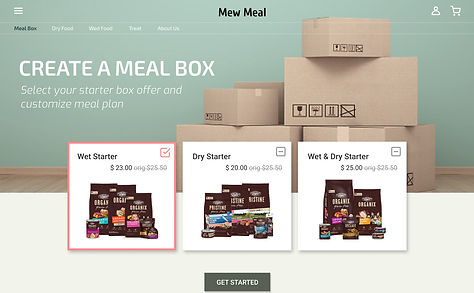
Customization
The customization process is too long. The number of clicks users had to do at the questionnaire screen to move on to the next question is too many, which make users feel tiresome
Mockups
Change # 1
Adding calendar
Based on the insights from the usability study, I made changes to improve the site’s checkout flow. One of the changes I made was adding the calendar to allow users to check the estimated delivery date based on the shipping date and the chosen shipping method.
Before Testing

After Testing

Change # 2
Cart and checkout
To make the checkout flow even easier for users, I revised the order summary page that comes right after customization of meal plan. The item list shows not only items of the meal plan but also extra items in the cart. This allows users to go through the checkout process once.
Before Testing

After Testing


.png)

Screen size variations
This hi-fi prototype followed the same user flow as the lo-fi prototype, and included the design changes made after the usability study.
Desktop

Tablet
Mobile

High-fidelity prototype
This hi-fi prototype followed the same user flow as the lo-fi prototype, and included the design changes made after the usability study.

GOING FOWARD
Takeaways
Being a cat person myself, working on Mew Meal was very joyful. My experience of fostering rescued cats helped me a lot in the process. However, I had to be cautious not to make assumption of users' experience. Identifying real needs users have even when they don't mention specifically was a key for user research and rewarding. Also I learned that even a small design change can have a huge impact on the user experience.